Monday 31 January 2011

*M* More Raven Box Concept Stuff


It looks quite boring, but this is the kinda the look I want for the Raven box interior. Sophie specified that it should have wooden textures inside. The last concept I did was more focused on the fact that these Ravens are very patriotic, and their feathers are very dark. I wanted to make sure the ravens stand out.
The other way we can make the Ravens stand out is by using lighting, and that's what I was looking at mostly here. More WIPs to come!

EDIT
Raven box now comes with furnishings and shnizz!


I think more could be done to this, but I like it so far. The lighting looks pretty darn good too. It should help draw attention to the ravens which will be situated in place like below:


EDIT

Got feedback on concepts. Taking wooden interior thing a little too literally.

Hey hey Emu - have seen your latest box interior....doesn't have to be wooden at all...should perhaps involve wood so you can tell the exterior is wooden, but wall paper or colours could work  - really have a play....I'm going to attach the concept bird in case you want to drop it in to sketches....

Hope your dissertation's going ok....mine's paaaaaaainfulll...


Sophiex


Most recent story edits By Andy Kinnear

Okay, I need to clarify that I DIDN'T DO THIS ANIMATIC. This is all Andy Kinnear's work. I just want to post this on here to show you what I'm working with, and for me to easily find and check every aspect of the story. 


EDIT

Here's a message Andy sent to me.

that script is being revised at the moment and i have a newer one that i will present with the storyboard but the camera looks great


So yeh the script is going to be different, but I'm going to leave it for now, until I get the update.
I'm really glad he likes the camera. Looks like that concept work is finished, another tick on my to-do list.

EDIT 2
Here's where you can find the storyboards Andy has done.

 http://thedeepgroup.blogspot.com/2011/02/storyboard.html

And here's where you can see the script

 http://thedeepgroup.blogspot.com/2011/02/current-script.html

I have printed all this stuff out so it is easier for me to look at while working.
FULL STEAM AHEAD!

Monday 24 January 2011

*M* Texture tests and line edits. That's a lot of cameras in one post O__O


Please click to enlarge, to see more detail.

Phwoarrr these cameras keep getting more and more smexy! Yep, I've been playing around a lot with the design, textures and colours. Me and Andy went through the images in the last post, and as you can see from the numerous scribbles, we managed to pick out some nice texture combos, and altered the design again. We came to a solution with the polaroid photos, and what happens to them when they get taken. They drop down into a lower compartment to be stored and looked at later on. They don't fly out the front,  like conventional polaroid cameras. So I enlarged the lower part of the camera (The base) and also rounded off the edges to make it look less sharp and pointy. You can see the before and after in the above picture. I also couldn't decide which texture would be suitable for the flash "supports" so I've shown two versions with different textures for each.


Above you can see the results of some photoshop messing about! I had a go at altering the settings, and it came up with some interesting alterations. I think some of the changes are a little too vivid, but I quite like the 2nd and last sets. I think generally the right versions with the silvery "supports" work best as well.

I shall await Andy's feedback now. I will also be doing some animatic work very soon for The Deep, so look out for that!

Wednesday 19 January 2011

*M* Orthographic Camera Study Progress

How it looks at the moment. Its a bit rough around the edges, but I like it. Of course I hope to neaten it up and play around with colour, but here it is, in beautiful blue lines

EDIT - Feedback from Andy Kinnear

Good work so far but i think ur taking the steam punk reference too literally like the cogs u have added u have to think to urself how do they work within the camera instead of it being dressed on to the camera
also i think hard edges with a couple of smooth ones could be quite nice helps with older stuff. materials maybe leather copper, bronze, darker metals

maybe do a picture with the kid holding the camera and see if that looks right 

Fairly positive, but I totally agree with Andy's critical notes there. The cog does look extremely out of place, now that I examine it more. I was thinking the cog could be like the spindle you turn to wind up the film in the camera, but I'm not sure whether it is necessary.

We actually have a fairly modern polaroid camera here at my house, so I've just examined it a bit more to see what facets it has. I t doesn't actually have a wind up "wheel", but this may be because it is modern enough to have a digital record of how many photos it has taken anyway. Basically, I'm just wondering whether we need a spindle on there at all.

I think softening the camera a bit more might help too. Like Andy said, varying the lines more will help give it more appeal.

I'm glad Andy mentioned materials too. It was dawning on me that I would need to eventually mess about with textures and stuff. Something else to look into.
Andy made a good suggestion about drawing the boy with the camera. It made me realize that the most important thing about the camera is that it needs to be easy for the boy to carry and use in the animation. If the object is too big or small, it won't work. If the components are difficult for the boy model to use effectively, that will also be a problem.

I think that the way I have fixed the flash on to the camera may complicate the way in which the boy has to carry it. The bar that stick out may get in the way. I might have to think again about how to alter this design aspect of the camera. 

*M* Steampunk

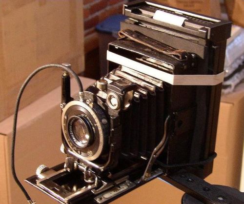
There are some real beauties I found on the internet. There aren't many steampunk-style cameras out there by the looks of things, but what I found has really impressed me. The attention to detail is rather astounding.

After close inspection and deep thought, I have come to the conclusion that I so like the steampunk look, but I don't want to as far as these specimens have been taken. I think it would be a challenge to make something as good as these in 3D, and I don't think we have enough time to really go to town doing that. I want to keep the camera simple and fairly easy to model, since we have a lot of other characters, props and environments to take care of. However, I may be underestimating a bit. I'd rather err on the side of caution.

So anyway, I am going to try and combine the best parts of the sketches I have already done, and create a rough drawing of the camera I think would work well. I want to make it a little interactive, but not so that it requires a lot of tinkering etc.

Monday 17 January 2011

*M* Polaroid Camera Collage And Drawings


In the above image, some of Andy Kinnear's pictures are featured. They are marked with AK. I have highlighted the areas that I think help me in these images with blue.
It looks like I'm kinda moving into a steam punk/victorian design for this camera. However, I haven't really thought much about how a camera like this would work underwater. Would it need protective gear around it to protect the mechanisms inside? I also assume that the polaroid photos will shoot out the camera, which is something that hasn't featured much in the storyboards thus far. Perhaps the photos will float in the water like leaves in the wind? I have also considered that the camera might have interactivity elements, like a mech arm that moves the flash up into position, and a cog for adjusting focus. Is that too much detail?

Since I am looking at a more steampunk look, I'm going to need to look into this style choice further, but I'd like to see what Andy thinks so far. :)

Saturday 15 January 2011

Lip Synch Practice

On the side of animating the Waltz and Penguin tests, I have been working on a lip synch animation on the side. The clip I chose is taken from "Step Brothers", a film starring Will Ferrel and John C Reilly. This particular quote from the film never fails to make me laugh, so I thought it would make a good study for an animation


Above you can see the rough lines I did to try and get the poses right. He is sitting at a table, with a plate in front of him. He is talking to a waiter to the left behind the camera. On the bottom right, you can just make out the face shape sketches I did to help with the actual lip synching. I had a lot of fun exaggerating the perspective of his face here, as you can see.

I have currently been working on the detail of the face, and I will hopefully finish that part soon.

Monday 10 January 2011

*IPP* Facebook Professional Page

Hey!

Its been a little while since I last posted something IPP related. Sorry about that! Other stuff has swallowed up my time, but it doesn't mean to say that I don't think about it a lot. I have set up a Personal Professional Page (PPP lol) on Facebook, to help broaden my networking on the internet.

http://www.facebook.com/?ref=home#!/pages/Emma-Wyton-Animator/137590642967436

Here it is, for your enjoyment. I uploaded my current showreel, which I hope to update and improve soon

*D* Knight - Detailed Keys And Livestream


Well, here's a cleaner version of the stick animation I did. It took so long to draw each of these frames. I still want to complete this, but this is what I have accomplished thus far.

I realized that I didn't exactly explain how I did this test, so here it goes...

I started off animating a circle for the head, so I could make it flow effectively with the music. I then animated his body and legs in. This meant that his chest and head would lead his motion, which suits his character - His heart and mind are in charge of his actions, and since he is in love, he has little control over what he does. I think I could have put that a little more eloquently, but I think you get the idea XD Lastly, I added in the arms. I tried think of how I would have my arms if I were doing those dance steps, and which pose would flow best.

Problems I Had

  • When I was detailing the leg keys, I found that sometimes the leg had been overstretched unintentionally. It was a bit difficult going back and changing them having gone into detail. Perhaps because I had not thought enough about how his legs would be in the early stages of animation. I must make sure that the poses are possible to do in real life, and don't look strange
  • I had some issues making my drawings look EXACTLY like the model, but I think I did pretty well considering. I must keep drawing him in my spare time, so that I become more comfortable drawing him, and it comes more naturally
  • His size still fluctuates a lot. I must keep the size of the character consistant.
  • I need to try and be a bit more brave when attempting to do perspective poses. I think at come points the poses look a little flat.
  • I need to work in 25fps in HD 1080 x 720 in future.
  • I must try and work faster. If I want to get stuff done and moving quickly, I need to get these line tests completed much quicker. Again this may be down to the fact I need to be a lot more comfortable drawing the character. At the moment, the speed that I draw the detailed poses is causing this to slow down everything. Perhaps after a few more line tests, I will get them done quicker and quicker.
Right, below is a video of me doing some animation in Toonboom. Half way in the vid I meddle with the sound, because my brother started playing the wii in the background! You don't have to watch it all, but you see me drawing out some poses at the end, and talking through the process and the model sheet at the beginning


Tuesday 4 January 2011

*D* YET ANOTHER Smitten Animation Test


I did this whilst on Livestream, but the movie is very large (45mins worth of footage!) So it's taking time to process. It may not even process at all. Stupid technology! If it does actually allow me to open the vid file and edit it down to a shorter length, I will upload it. :D

Pretty pleased with the work so far. The end bit needs work or changing. I've also started drawing the arm poses in, and they seem to meld into the frames well.

BIG THUMBS UP

EDIT: Matt Vadis' feedback on tests

Hey Em

Thanks for the hard work you've been doing, you're really cranking them out. Ye it's your best one yet - nice and fluid, in time with the accents of the music and has variety in the movements, which is good because if we stick to the sort of rigid posture of an actual waltz dancer i think it would get boring.

As far as criticism goes, i'd say push the key poses even more. This guy's theatrical so think of those melodramatic gestures in Shakespeare plays, they're almost laughable which is sort of what we're going for. There's a part where he looks like he's sneaking, maybe to make it look more like a dance try widening his steps so you really see the energy in moving from one spot to another - almost like the way a roller-coaster speeds up on the downhills and slows on the ups.

Don't stress yourself trying to apply any changes I think you've done enough for now, just keep in mind what i've said. I think we're ready to start animating the real thing.

I think Matt made some very good points here about where I can improve. At the moment, I am neatening up the test above, and drawing the knight over the top of the rough stick man poses. Fingers crossed it will look alright!

So far it has been quite time-consuming but I'll keep at it.
:D

Saturday 1 January 2011

*D* Another Smitten Animation Test


I'm gonna add to this more and more, just posting this now to show how it's going so far :I

*D* Further thoughts about the Smitten animation

I have also just remembered something that Matt Vadis told me. I should listen to the music and let that guide me. In the same way that the knight Don Juanova is led by his heart, I need to be led by the music to go in the right direction for his animation.

When I was directly using the Waltz reference to animate to, I found that the pace that the dancers were moving was far too swift. It made my head spin trying to directly mirror it in a fun way. However, I have learnt that there are some nice arcs of the arms and legs that will provide some strong poses to use.

Dan has also said that he can arrange for us to go to a dance studio to watch and sketch live dancers perform. I am really up for this! I haven't done proper Life Drawing for quite a long time, so I am eager to lap up this opportunity!


Sorry, just stuff I wanted to empty out my head. Will be working on another test for the deadline on 10th January. Should be good, as long as I take on board all I have learnt so far.

*D* Happy New Year! An update overdue

Hey! Here's my first post to my blog in 2011. Lets hope its the first of many cool things to show you all!


Right, I have two test movies to post up. Fingers crossed they come out alright on here

The 1st is a clip playing around with the Knight dancing. This was made taking into account stuff I had learnt from making the previous two tests


I showed Dan this vid and the 2nd one, and he said that I needed to slow in inbetween taking steps. He would be very light on his feet, so he will spend more time on tip-toes then landing a foot on the ground. He is a little heavy footed here.

The other clip I did was a 2D test on how the penguin would move. Its extremely simple, but I wanted to play around with how his cone shape would move in water.


However, there has been a drastic change to the story of The Deep. Andy sent me the following message:


hi emma i thought i would let u know that i have come to the decision to cut the penguin from the film. this is due to drastic story changes and the flow and character relationships.

thank you soo much for all ur hard work and please dont think it has gone to waste as it will still be presented in the development stages even in the later stages of the production.

the penguin in the film did not fit as it was used mainly as a directing tool to get the kid in the water, after that the penguin got in the way of the story and characters. the story now focuses on the eel and kid resulting in a better flow and arc for both characters and story.

once again im sorry but please let me know if ur available for anymore design work

thanks andy k 
I admit I am a little disappointed, because I had really taken to the cute fella, but I am behind Andy all the way on the decisions he makes. Hopefully this change will be to the benefit to the project, and will help us come up with a cool result!
The work I did towards the penguin character is in no way a waste, I have learnt a lot from the experience and had a lot of fun producing it all. In the industry, this kinda thing happens all the time. If a character doesn't quite flow in the story, they often have to be removed to help accommodate a better plot.
Andy has asked me to do some more work for the team though, I am to design a polaroid camera for the boy to use. I must research cameras and come up with something that can be made and used in the film.